In 2020 Pantone’s colour of the year choice, Classic Blue, proved eerily prescient. Announced weeks before the first Covid-19 cluster was discovered, it is a shade used for medical scrubs around the globe.
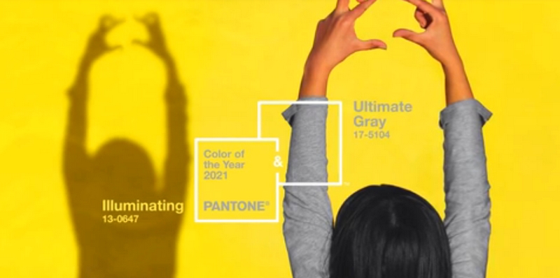
Perhaps knowing that lightning is unlikely to strike twice, for 2021 the US-paint brand’s team of trend forecasters have selected two shades – Ultimate Grey and Illuminating – the second time they have done so in the Colour of the Year’s two decade history.
Used by fashion, graphic and interior designers, the Pantone Institute’s colour matching services are a resource for predicting palettes that might prove popular with consumers. Their colour of the year choices are often contentious.
This year, the combination has been likened to the shades of hi-vis vests, road markings and “screaming sickly urban melancholy, a brutalist facade, cold sunshine and cement”. Vogue described it simply as “really weird”.
PANTONE® color of the year 2021 aesthetics pic.twitter.com/SQPTOllRPg
— básico de rosto (@caiofall) December 9, 2020
Pantone say their choices this year as “a message of happiness supported by fortitude”. But darker readings of Ultimate Grey, a pale shade of dove they liken to “pebbles on the beach and natural elements” aren’t hard to come by. The track pants we’ve all been pulling on each morning; the sameness of days blurring into one another; the vinyl floors of an ICU ward.
Pantone 2021 pic.twitter.com/sFIlbHvIBr
The Map to Modern LuxuryTHE CURATED CALENDAR
Discover the world’s most prestigious gatherings & exhibitions— Laura Athayde (@ltdathayde) December 10, 2020
Their second choice Illuminating is a buttercup yellow, which Pantone describe as “bright and cheerful”; “sparkling with vivacity” and “imbued with solar power”. It is the first time in over a decade a shade of yellow has been chosen. In 2009, when they selected a warmer yellow, Mimosa, they said “no other colour expresses hope and reassurance more than yellow”. A lot may have changed in 10 years, but it seems Pantone’s interpretation of yellow has not.
Speaking with Vogue, Pantone’s trend forecasters explained they selected two colours because, “it became apparent that there was never going to be one colour that could express everything that needed to be expressed — that it was, instead, critical to have two independent colours that could come together.”
Back in 2016, when they selected Rose Quartz a shade that became more popularly known as Millennial Pink; paired with a soft blue Serenity, the dual choice represented “wellness” and “movements toward gender equality and fluidity”.
Pantone’s Colour of the Year choices often make a social statement – the climate crisis was a clear leaping-off point for 2019’s choice Living Coral and 2017’s shade Greenery. In September this year, the paint brand also launched a vibrant shade of red Period in a bid to end stigmas around menstruation.
guardian.co.uk © Guardian News & Media Limited 2010
Published via the Guardian News Feed plugin for WordPress.