Pantone Color Institute celebrates the rainbow’s most complex color through whisky

    The Macallan Edition Purple – A Celebration of Natural Color in Partnership with Pantone Color Institute. The Macallan Unveils Edition No. 5 Whisky and The Macallan Edition Purple. The whisky colour that makes up The Macallan Edition No. 5 is called ‘sunlit barley’, created during the maturation process inside exceptional American Oak casks. … Read more

Color of the Year 2019: The engaging nature of Pantone Living Coral encourages lighthearted activity

  For 20 years, Pantone’s Color of the Year has influenced product development and purchasing decisions in multiple industries, including fashion, home furnishings, and industrial design, as well as product, packaging and graphic design. Symbolizing our innate need for optimism and joyful pursuits, PANTONE 16-1546 Living Coral embodies our desire for playful expression. Pantone, provider … Read more

Some brands succeed while others fail. Why?

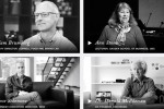
Top names in design and innovation explore the details of color in design: “Color In Sight: A Documentary on the Details of Color in Design.”

pantonetea

In an increasingly digitally connected world, research from Microsoft Corp. has shown that the average human attention span has fallen from eleven to just eight seconds. That’s one second less than that of the goldfish, believed to retain a solid nine. With such a competitive landscape, only the best brands can convey their message and connect with people almost instantaneously.

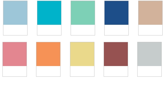
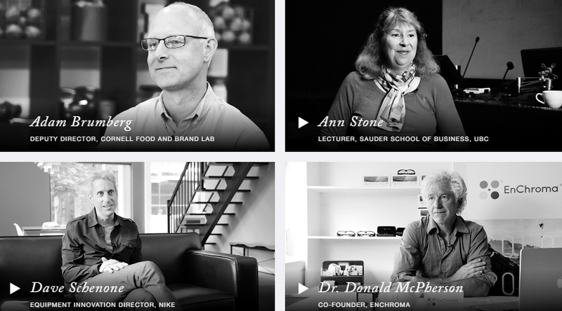
A new documentary called “Color In Sight: A Documentary on the Details of Color in Design” explores the potential of color to excite and convey stories and values. Released by luxury tea brand Tealeaves, the new video material features some of the top names in design and innovation, including the “first lady of nails”, Co-founder of OPI Suzi Weiss-Fischmann, Herman Miller’s Laura Guido-Clark, Laurie Pressman of the Pantone Color Institute™ and former Innovation Director at Nike, Dave Schenone.

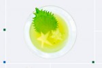
The documentary is a real proof that the first taste is with the eyes.

paletteforyourpalate some-brands-succeed-while-others-fail-why

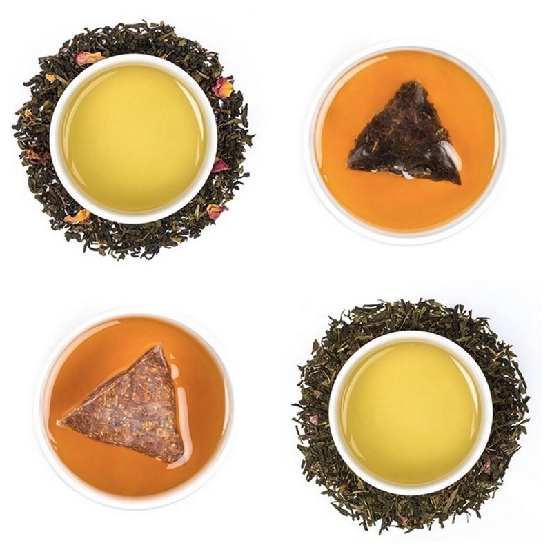
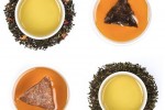
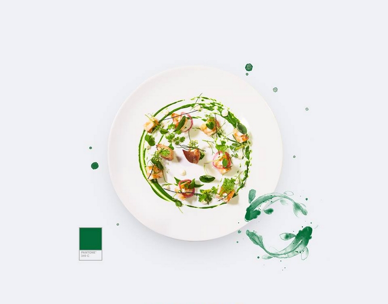
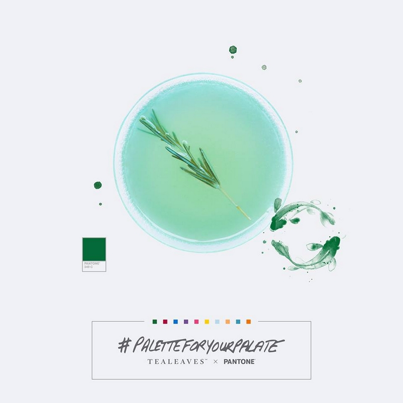
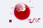
“In luxury, it’s the details that matter and the detail of color is so important in what we do – from the inside, the product, to the outside, the packaging. We hand blend our teas specifically for color, alongside aroma and taste, with understanding that ‘the first taste is with the eyes,’” says Tealeaves CEO Lana Sutherland.

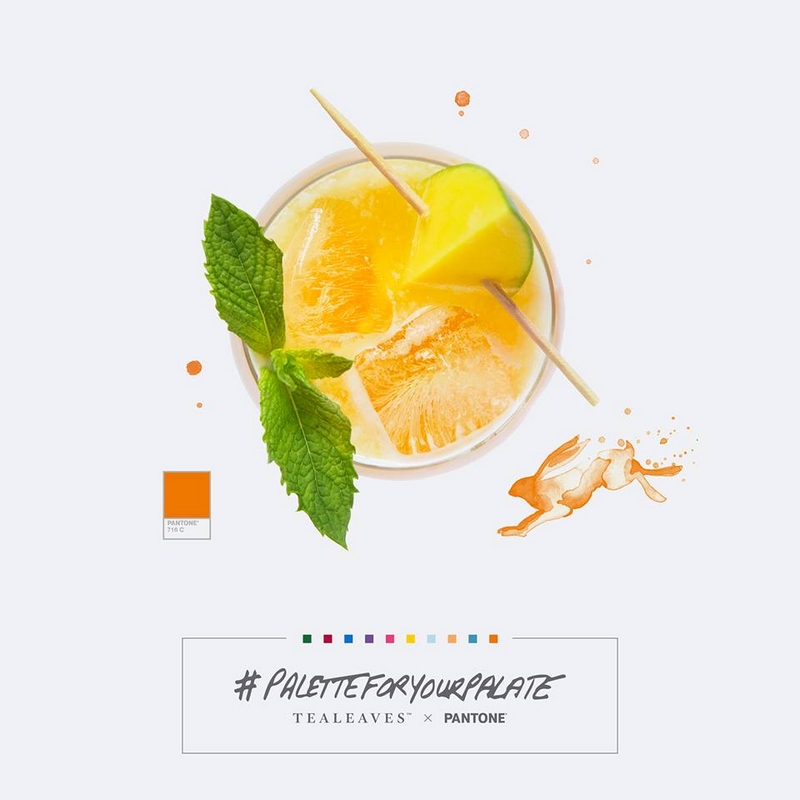
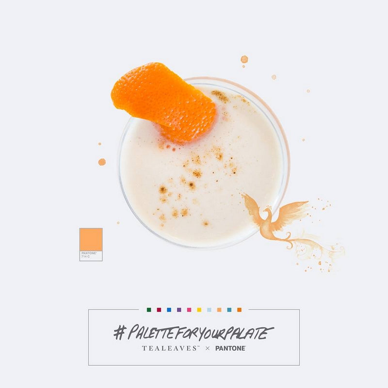
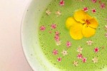
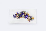
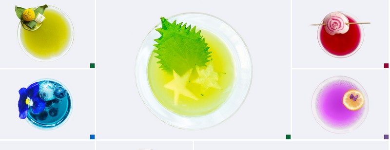
“When we craft custom blends for our clients, we treat blending for color as importantly as blending for aroma and taste. For example, instead of blending iced teas to look dark and saturated like the industry standard, we blend our iced teas so that they are more rich and golden in hue, reminiscent of scotch on the rocks. This added effort gives our blends more character and creates a more luxurious experience, suitable for the environments in which they are served: five-star hotels and Michelin star restaurants.”

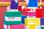
“Tealeaves has helped inspire creativity in the kitchen and bar for over two decades, and we are now expanding into the homes of designers, innovators, thought-leaders, and tea lovers. The documentary is a first step in this direction. We documented our journey to share with the world, with belief that the best condiment to any cup of tea is wisdom to share and a great story to tell. From PANTONE and Herman Miller to Kidrobot, the Cornell Food and Brand Lab, EnChroma, and Michelin-awarded Juni, all of these experts volunteered their time for this exciting project,” says Sutherland.

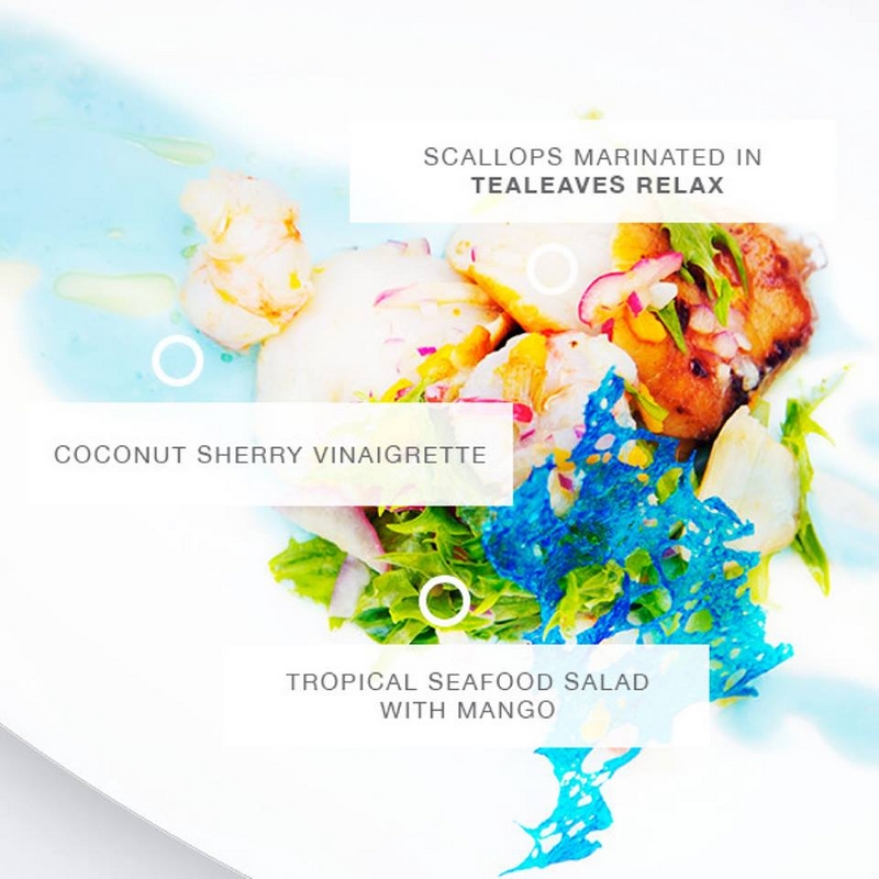
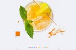
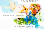
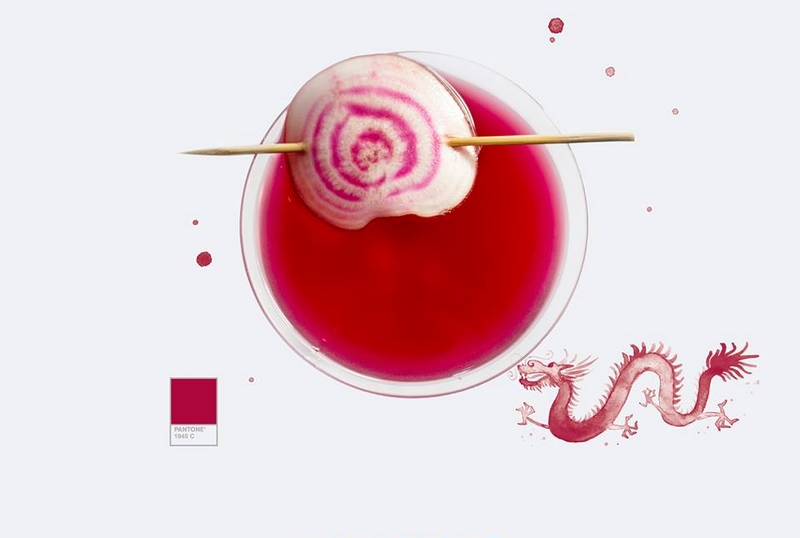
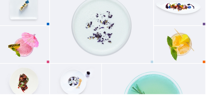
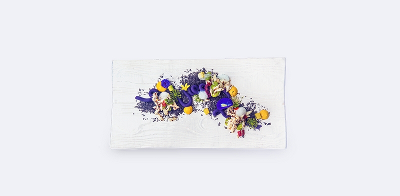
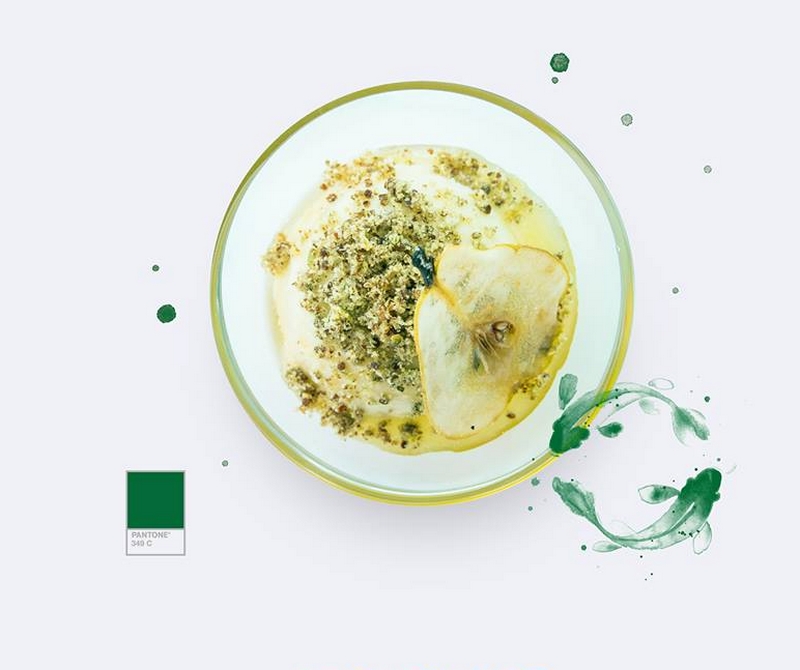
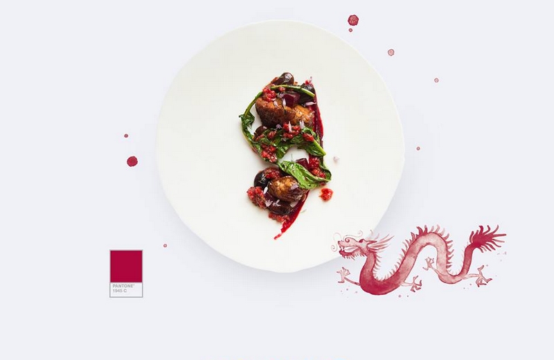
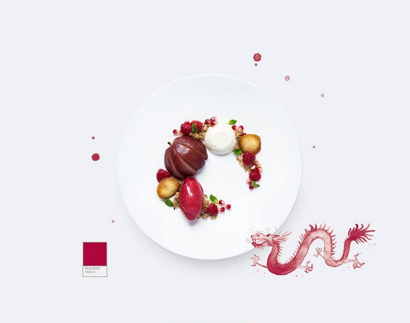
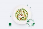
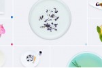
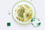
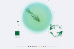
Color In Sight was released through the online exhibit, paletteforyourpalate.com, a color collaboration between Tealeaves and global color authority pantone that showcases the strong influence color has on food and drink experiences. The exhibit features the tea cocktail, tea entrée, and tea dessert creations of 30+ world-class chefs and mixologists using Tealeaves Whole Leaf Pyramid Teabags as muse, and has gained traction among food aficionados and design circles, alike.Watch the documentary here: 

paletteforyourpalate-pantone-x-tealeaves

paletteforyourpalate-pantone-x-tealeaves

paletteforyourpalate

luxury-tealeaves-blends-to-mark-a-holiday-weekend

matcha-bowl-with-fresh-flowers-from-teaspoons-and-petals

#PaletteForYourPalate: 10 iconic tea blends are muse to over 30+ world-class chefs and mixologists

Plated Expressionism: ‘to infuse a dish with a specific color, a secret ingredient and a particular mood’.
paletteforyourpalate-entries

Luxury tea Tealeaves, a brand of choice for five-star hotels and Michelin chefs worldwide, and global color authority Pantone launched an online exhibition that showcases the strong influence color has on food and drink experiences.

The exhibit, paletteforyourpalate.com displays the tea-infused creations of 34 world-renowned culinary, pastry and mixology artists. The exhibit also includes a documentary that explores the potential of color to excite and convey stories and values. It features some of the top names in design and innovation, including the “first lady of nails”, Co-founder of OPI Suzi Weiss-Fischmann, and former Innovation Director at Nike, Dave Schenone.

“This collaboration and online exhibition arose from our desire to create an elevated experience for consumers, using color to connect on a deeper and much more emotional level,” says Lana Sutherland, CEO of Tealeaves. “Color is naturally associated with mood, so we wanted to select the perfect color for our packaging, to match the precision that we demand when blending our teas.”

paletteforyourpalate-english breakfast

Culinary and mixology artists have used Tealeaves’ teas in their repertoire of secret ingredients for more than two decades. At the world’s most prestigious culinary competition, Bocuse d’Or teams have used Tealeaves’ teas to amplify the intensity of their creations. In fact, premier chefs such as Alain Ducasse will be carrying the new Tealeaves’ Whole Leaf Pyramid Teabag collection at their restaurants this fall.

Tealeaves challenged chefs and mixologists to create a recipe inspired by Tealeaves’ Teabag collection + PANTONE Colors + their associated mood. In addition, the final color of each cocktail, entree and dessert was to be derived naturally from the ingredients alone.

paletteforyourpalate-entries-Entree No. 1 Green Meditations

Entree No. 1 Green Meditations = 1 part Tealeaves #LongLifeGreen + 1 part #Pantone 349C + 1 part Mood: Enlightened. Created by Boulevard Kitchen & Oyster Bar culinary artist Executive Chef Alex Chen.

paletteforyourpalate-Cocktail No. 1A Benzaiten

Cocktail No. 1A Benzaiten = 1 part Tealeaves #LongLifeGreen + 1 part #Pantone 349C + 1 part Mood: Enlightened. Created by
Fairmont Pacific Rim Hotel mixology artist Grant Sceney.

paletteforyourpalate-Dessert No. 1 Fall Awakening

Dessert No. 1 Fall Awakening = 1 part Tealeaves #LongLifeGreen + 1 part #Pantone 349C + 1 part Mood: Enlightened. Created by
Four Seasons Hotel Vancouver pastry artist Bruno Feldeisen, with plate as canvas and Tealeaves LongLifeGreen as muse.

Entrée No. 2 Smooth Sophistication

Entrée No. 2 Smooth Sophistication = 1 part Tealeaves #ImperialOolong + 1 part #Pantone 1945C + 1 part Mood: #Sophisticated.
Created by The Rittenhouse culinary artist Executive Chef Jonathan Cichon.

paletteforyourpalate-Dessert No. 2 Seeing Scarlet

Dessert No. 2 Seeing Scarlet = 1 part Tealeaves #ImperialOolong + 1 part #Pantone 1945C + 1 part Mood: #Sophisticated.
Created by Tealeaves pastry artist Christine Yen, with plate as canvas and Tealeaves ImperialOolong as muse.

paletteforyourpalate-Cocktail No. 2 The Royal Tea

Cocktail No. 2 The Royal Tea = 1 part Tealeaves #ImperialOolong + 1 part #Pantone 1945C + 1 part Mood: Sophisticated. Created
by Mandarin Oriental, New York mixology artist Julie Van Zant.

#paletteforyourpalate Participants:

  • US

Andaz West Hollywood;
The Beverly Hills Hotel;
Calistoga Ranch, An Auberge Resort;
Conrad New York;
Delano Las Vegas;
Four Seasons Los Angeles at Beverly Hills;
Four Seasons Resort Palm Beach;
Juni;
Mandarin Oriental, Las Vegas;
Mandarin Oriental, Miami;
Mandarin Oriental, New York;
The Rittenhouse Philadelphia;
Rosewood CordeValle;
The St. Regis Bal Harbour Resort;
The St. Regis San Francisco.

  • Canada

Beta5 Chocolates;
Boulevard Kitchen & Oyster Bar;
Chez Christophe Chocolaterie Patisserie;
Fairmont Pacific Rim;
Four Seasons Hotel Toronto;
Four Seasons Hotel Vancouver;
Omni King Edward Hotel;
Railtown Cafe.


“En plein air’ Aquamarine, Scuba Blue, and Lucite Green. The next spring Women’s Color Palette

Top 10 Colors for #Spring2015. The PANTONE Fashion Color Report Spring 2015. Pantone unveiled the top 10 spring shades called upon for the women’s and men’s collections. Released to coincide with New York Fashion Week, the PANTONE Fashion Color Report features the top 10 colors for women’s and men’s fashion for spring 2015, along with … Read more

Radiant Orchid revealed as color of the year

Captivating, magical, enigmatic purple is the color of the year for 2014. Emerald, last year’s cool color, made place to ‘radiant orchid’, Pantone’s pick for 2014. The global color authority and provider of professional color standards also unveiled its first ever clothing line – the Universe Colorwear men’s wear collection. “While the 2013 color of … Read more